Life Design System & UX Motion
Role: Product Designer, UX Motion Designer
Developed motion guidelines for the Life Design System and leveraged motion elements to tackle and enhance user experience issues. Additionally, created an application from scratch.
Other Collaborators: Peter Yejun Tak, Amy Kim
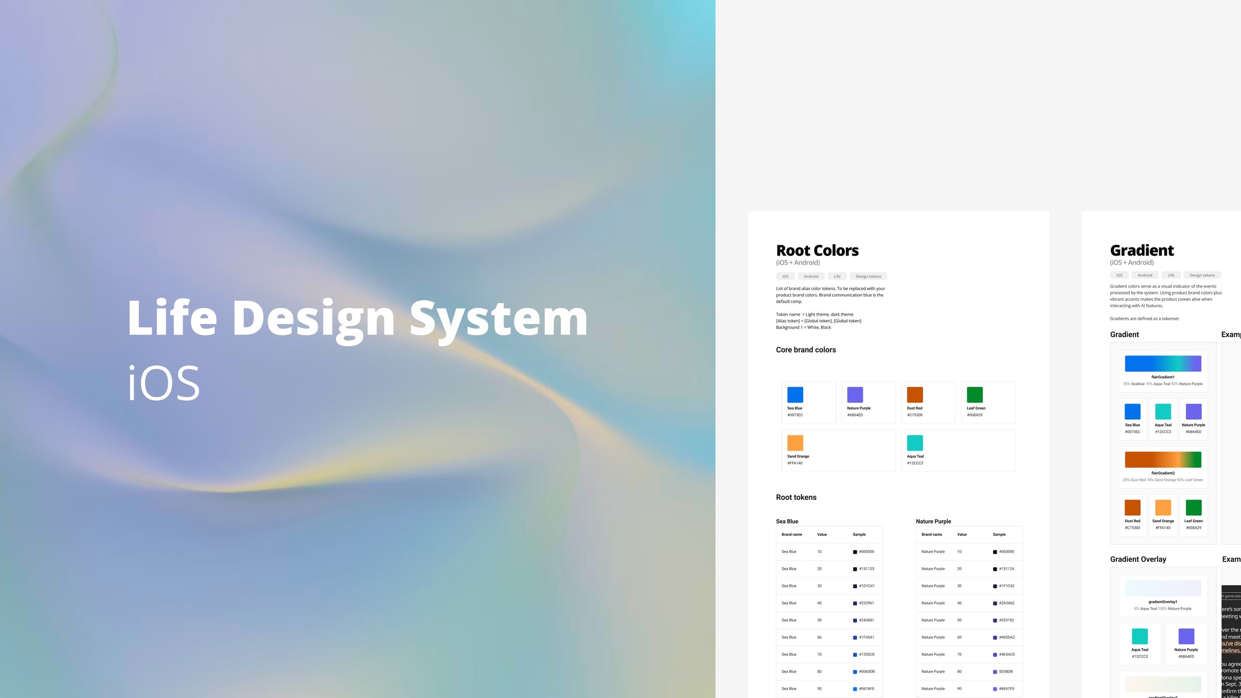
Developed the Life Design System for iOS starting from scratch, including defining the brand colors and generating tokens suitable for both light and dark modes.
OnLife offers a range of health and wellness products designed for individuals seeking to enhance their quality of life. As a health-focused brand, we prioritize accessibility and guidance in our design principles.
We understand that health and wellness apps can become overwhelming as they incorporate more features that may not align with users' primary objectives. To address this issue, we are developing a suite of user-friendly applications aimed at making your journey towards better health and well-being as seamless as possible.
Motion rules
Based on our design principles, I've formulated high-level rules for animation:

Transition patterns
The motion rule 1, "Show, don't tell" is applied to transition patterns to create a sense of space and make it easier for users to navigate the app, in addition to providing feedback through motion.
Rule 1. Show, don’t tell
Micro-animation
I applied Rule 2, amplifying action through micro-animations in Shabits, a habit app designed to bring significant changes through small steps. By implementing this rule, I explored methods to prompt users to initiate their habits more effectively.
Rule 2. Amplify action
Mobile to TV
My vision for Shabits extends to creating a visual habit planner accessible on users' TVs, allowing them to seamlessly integrate it into their daily routines without the need to constantly refer to their phones. This approach is particularly beneficial for hands-free habits.
Rule 3. Device adaptive
For the TV design, I capitalized on the widescreen format to maximize usability. Motion is used strategically to capture users' attention. The timer slides left while relevant YouTube videos related to the habit appear on the right. This setup encourages users to initiate their habits with small actions, maintain momentum, and exceed their original goals.
Various adjustments were made to optimize the animation for larger screens:
Motion is slower and more subtle to accommodate the increased screen size.
A default dark mode is implemented to reduce eye strain and minimize energy consumption.
Success metrics
I'll be validating the design using the HEART framework, focusing particularly on Happiness and Retention metrics.
